Revise
Graphs and Data
Graphs and Data
The best way to visually represent data from an experiment is to draw a graph. Graphs often give us more insight into our data than just a results table would. It is important to know what type of graph to draw, and how to use it.
Presenting Data
Before drawing a graph from our experimental data, we must understand our data in more detail and decide what type of visualisation the data requires.
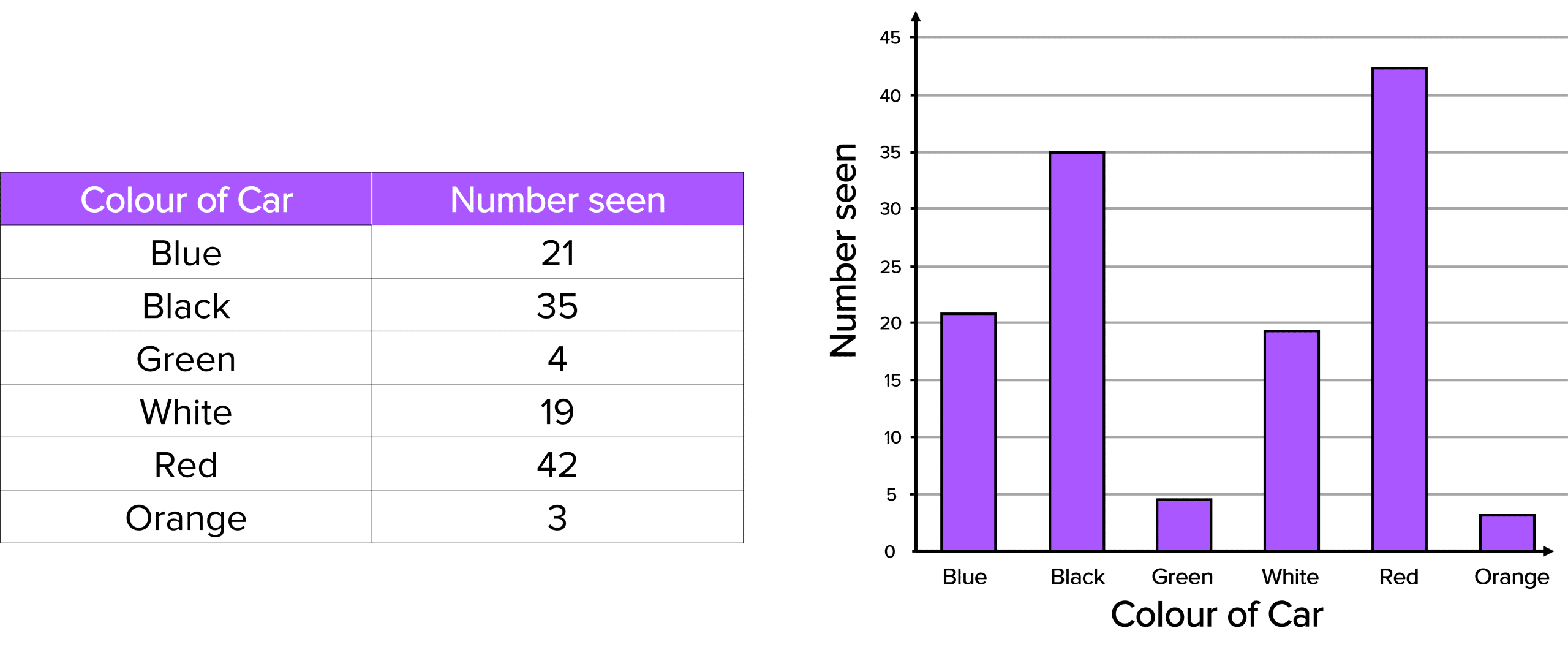
If the independent variable is discrete (comes in separate categories), then a bar chart is the most appropriate to draw. This is because discrete data is not made up of continuous numbers. An example of some discrete data is shown below with it’s corresponding bar chart.
Example:
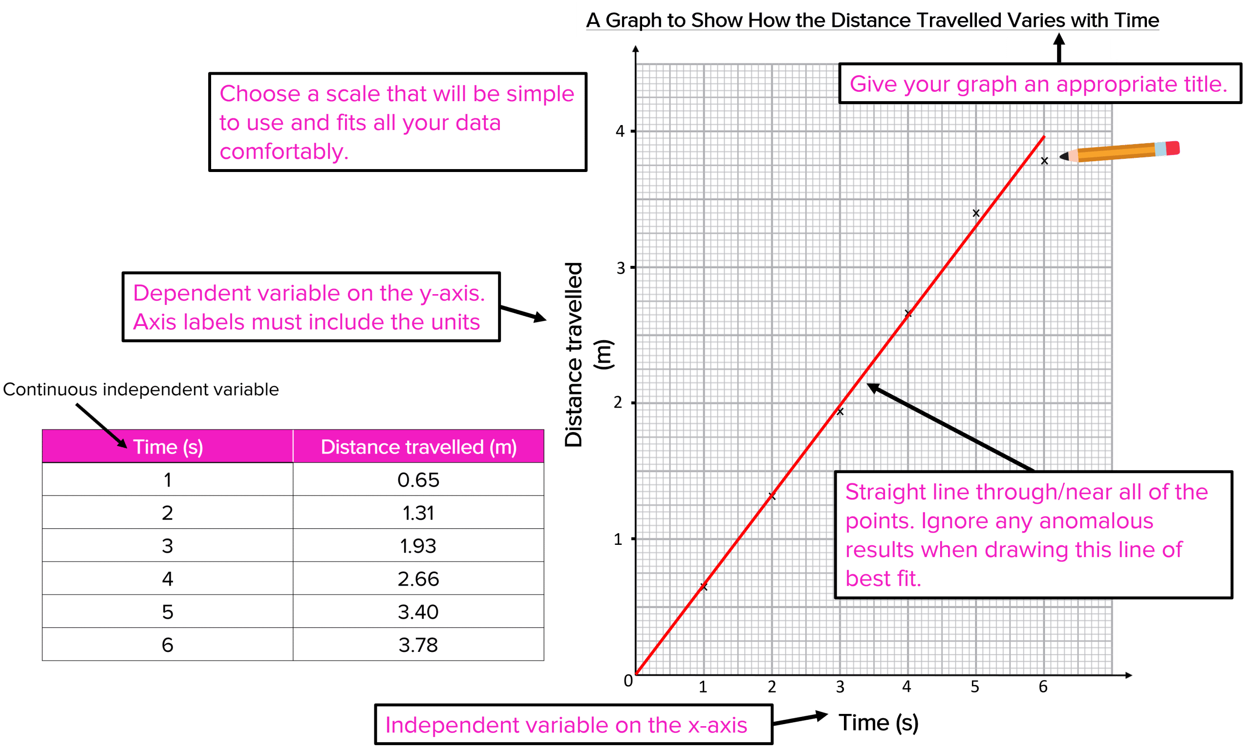
If we are working with numerical variables, where both are continuous, we should draw a line graph. This is the graph you will use in most of your experiments. Continuous data is numerical data that we can measure. Examples of continuous data could be force, rate of reaction, voltage etc. We should plot our data and then draw a line of best fit through it. This is simply a line that goes through or passes near all of the points. An example of some continuous data is shown below with it’s corresponding graph.
Example:

Utilising Graphs
We can use graphs to extract information from our results. One value we can calculate from our graph is the gradient. The gradient will give us the rate at which the dependent variable changes with the independent variable.
The gradient is given by the change in the y axis divided by the change in the x axis:
\text{Gradient} = \dfrac{\text{Change in y}}{\text{Change in x}}
We can calculate the gradient of the Distance-Time graph from the previous box:
- We first should pick 2 points on the line.
- Draw two lines so that the points meet.
- Use these lines to read off the change in the y axis values and the change in the x axis values.
- Calculate your gradient.
The intercept of a graph is where the line of best fit meets the axes. We can see in the above example that the intercept is at the origin \left(0 ,0\right). We know this is correct because when the time is at 0 seconds, the distance travelled must be 0 metres.

Extrapolating
We can use graphs to predict possible data values that aren’t in the results. This is called extrapolation.
We can illustrate this by using extrapolation to predict what the distance travelled might be at 7 seconds.
First we must extend our line of best fit until it reaches the value we want to extrapolate. This is shown on the diagram with the green segment of the line. Then we just read off the distance value at 7 seconds. The distance travelled is 4.6 metres. Again this is just a prediction because our experiment didn’t include any readings for 7 seconds, so we have extrapolated.
Graphs and Data Example Questions
Question 1: State which type of graph/chart should be used to present the following dataset. Give a reason for your answer.
| Student | Number of Televisions in their House |
| Romualdo | 1 |
| Janine | 5 |
| Anneli | 0 |
| Fletcher | 2 |
[2 marks]
Bar Chart.
Because the independent variable is not a set of continuous numbers (it is discrete).

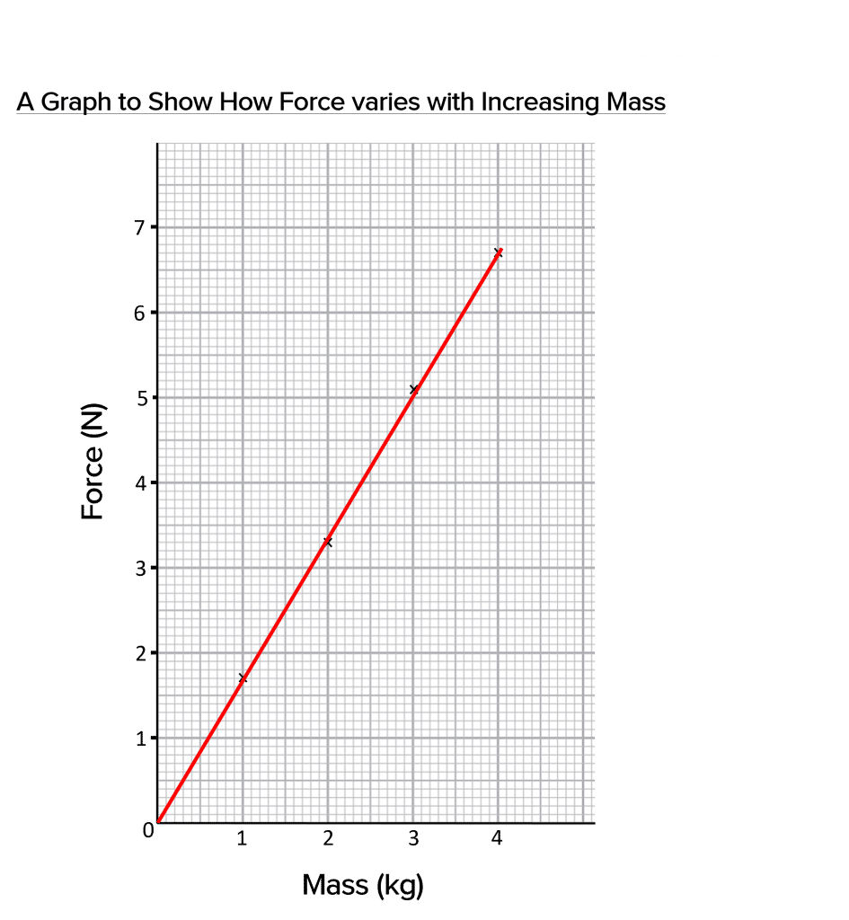
Question 2: Plot a graph using the following results table:
| Mass \left(\textbf{kg}\right) | Force \left(\textbf{N}\right) |
| 1 | 1.70 |
| 2 | 3.29 |
| 3 | 5.07 |
| 4 | 6.68 |
[5 marks]
1 mark for each of the following:
- y-axis correctly labelled, with units.
- x-axis correctly labelled, with units.
- Appropriate title.
- All points plotted correctly.
- Line of best fit through points.
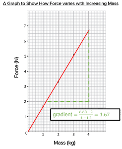
Question 3: Calculate the gradient of the graph you drew in Question 2.
[2 marks]
Use of \text{Gradient} = \dfrac{\text{Change in y}}{\text{Change in x}}.