
Revise
Correlation and Regression
Correlation and Regression
Correlation and regression both pertain to data measured in pairs – called bivariate data. Correlation is a measure of how closely linked the two data sets are, and how they affect each other. Regression is the line of best fit.


A Level Maths Predicted Papers 2026
Our A Level Maths Predicted Papers are produced to the same high standard as real A Level exam papers. Every question is written and reviewed by experienced exam specialists to ensure the level of challenge, structure and presentation closely reflect genuine A Level maths exams. Each pack includes professionally printed papers alongside physical mark schemes, giving students an accurate, exam-style experience that cannot be replicated with PDFs or generic revision sheets. Select your exam board and receive exclusive A Level maths predicted papers available only from MME.
View Product
A-A* A Level Maths Practice Papers
The MME A-A* A level maths practice papers are excellent for those top achieving students to practise for their exams, using authentic exam style questions that are unique to our practice papers. Our content experts have studied A level maths past papers and specifications to develop specific A-A* A level maths exam questions in an authentic exam style. The profit from every pack is reinvested into making free content on MME, which benefits millions of learners across the country.
View Product
Correlation and Scatter Graphs
When we have bivariate data, one variable will be the independent (or explanatory) variable, and another will be the dependent (or response) variable. The independent variable is the one that you can control, and goes on the x axis. The dependent variable is the one that is being affected, and it goes on the y axis.
There won’t always be a clear independent and dependent variable, and in that case it is not as important which way round they go on a scatter graph.
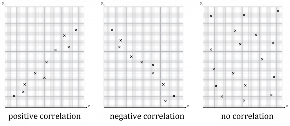
Correlation comes in three flavours: positive, negative and no correlation. In positive correlation, as one variable goes up so does the other. In negative correlation, as one variable goes up the other goes down. In no correlation, there is no clear link between the variables.
Correlation can also be strong or weak. In strong correlation, the data is very close to forming a line. In weak correlation, the data is not close to forming a line.
Outliers look obvious on a scatter graph. They can be ignored in subsequent calculation – but if you do plan to ignore an outlier make sure you clearly mark it on the graph as such.
You should also be aware of clusters. This is where the data forms several separate groups on the graph. We can talk about overall correlation and correlation in clusters. For example, in the graph on the right, there is negative correlation overall but positive correlation in the clusters.
Regression
The regression line of \mathbf{y} on \mathbf{x} is the line of best fit. It is always written in the same form:
y=a+bx
a is the y intercept
b is the gradient
The regression line can be used to predict values of the dependent variable. This comes in two flavours:
- Interpolation – If the value of x being used in the prediction falls inside the range of the values of x in the data. The predicted value should be reliable.
- Extrapolation – If the value of x being used in the prediction falls outside of the range of the values of x in the data. The predicted value might be unreliable.
Regression with Coded Data
Regression can also be done on coded data. All we do is we substitute the coding into our regression line, then rearrange to get it back in straight line form.
Example: y=4+10x, with coding s=2y, t=x-3 becomes:
\begin{aligned}\dfrac{s}{2}&=4+10(t+3)\\[1.2em]&=4+10t+30\\[1.2em]&=34+10t\end{aligned}
s=68+20t
Also, we can form regression lines from non-linear data in some cases.
Example: y=ax^{n} becomes log(y)=log(a)+nlog(x) which is regression in log(y) and log(x).
Example 1: Correlation
Plot a scatter graph then describe the correlation of this data:
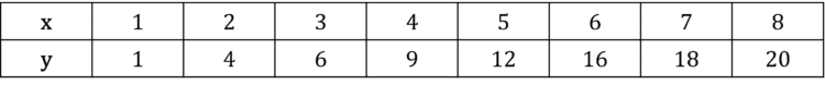
[4 marks]
Plot the points on the graph:
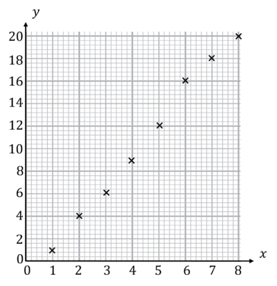
This graph shows positive correlation.
Example 2: Regression
Data is collected about the temperature of the water in a kettle in °C over time in minutes. The regression line is:
y=20+40x
What is the gradient and y-intercept, and what do these mean in the context of the experiment. How long does the kettle take to boil?
[5 marks]
Gradient is 40°C
y-intercept is 20°C
In context, this means that the water starts at a temperature of 20°C and rises by 40°C every minute.
The kettle finishes boiling at 100°C. Substitute this value into the expression:
100=20+40x
40x=80
x=2 minutes
Correlation and Regression Example Questions
Question 1: The table below shows the results of fuel efficiency tests where x is the amount of fuel placed into the vehicle in litres and y is the distance the vehicle travelled before it ran out of fuel.
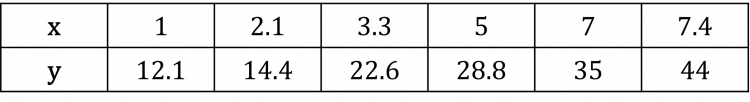
i) Plot a scatter graph of this data.
ii) What kind of correlation is shown?
[4 marks]
Plot the points on the graph:
This graph shows positive correlation.

Question 2: The data below shows how long bacteria lived after being placed into more and more alkaline solutions. x is the pH of the solution and y is the time in seconds the bacterium lived.
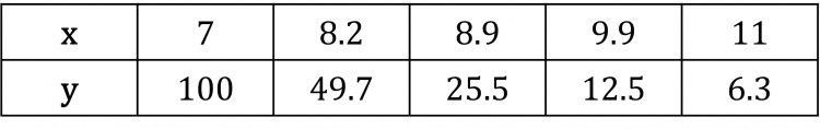
i) Plot this data on a scatter graph.
ii) Describe the correlation.
[4 marks]
Plot the points on the graph.
This graph shows negative correlation.
Question 3: A regression line of y=a+bx describes a correlation.
i) What are a and b?
ii) If there is negative correlation, is b>0?
iii) What value does y take when x=0?
iv) Suppose this regression describes the size of birds against the distance they travel to migrate. What does b mean? Is the physical interpretation for a sensible?
[6 marks]
i) a is y-intercept
b is gradient
ii) Negative correlation means b<0
iii) y=a because a is the y-intercept
iv) b is the gradient so it is the amount of distance further a bird travels to migrate per unit weight
a is the travel distance of a bird of 0 weight. Since birds cannot have no weight, this is not sensible.
Question 4: The regression line of y on x is y=8x+3. The data is coded with s=\dfrac{y}{10}+4 and t=4(x+3). Find the regression line of s on t.
[4 marks]
y=8x+3
s=\dfrac{y}{10}+4
Rearrange to find y
s-4=\dfrac{y}{10}
y=10(s-4)
t=4(x+3)
Rearrange to find x
\dfrac{t}{4}=x+3
x=\dfrac{t}{4}-3
Substitute in the expressions for x and y
10(s-4)=8\left(\dfrac{t}{4}-3\right)+3
10s-40=2t-24+3
10s-40=2t-21
10s=2t+19
s=\dfrac{1}{5}t+\dfrac{19}{10}
Question 5: Describe as fully as possible the correlation pictured.
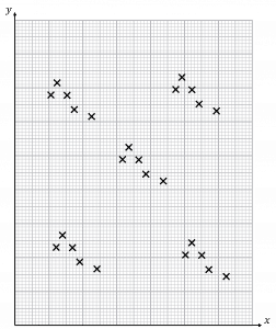
[3 marks]
This graph shows correlation in clusters.
There is negative correlation within the clusters.
There is no correlation overall.
Specification Points Covered
L2 – Understand informal interpretation of correlation, understand that correlation does not imply causation
Correlation and Regression Worksheet and Example Questions
Correlation
A Level