Line Graphs
Line Graphs Revision
Line Graphs
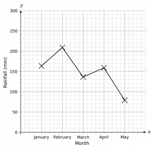
A line graph is used to compare two sets of data that are related in some way. Most commonly, a line graph is used to show how something changes over time – maybe over the course of a week, a year, or even longer.
Having an understanding of scatter graphs will help with this topic.
Drawing a Line Graph
Drawing a line graph is fairly simple and builds on our previous knowledge of scatter graphs.
Example:
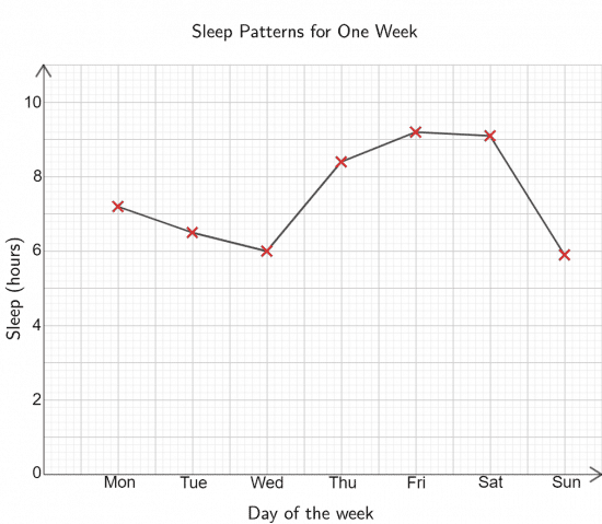
David collected data on how much sleep he got each night for a week. His results are collected in the table shown below. Construct a line graph to represent his data.

When constructing a line graph, we typically choose to put the independent variable (i.e. the thing that we control) on the x-axis, whilst the dependent variable (the thing we’re measuring) goes on the y-axis. So, our line graph will have
- The days of the week on the x-axis, equally spaced
- The number of hours of sleep on the y-axis
- Axes labels
- A title
Then, to make this into a line graph, we need to connect each of the individual points using straight lines. The result should look like the graph below.
Line Graphs Example Questions
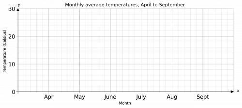
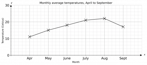
Question 1: Syd recorded the temperature outside his house at 1:00 pm every day for 6 months. He used the data to find the average temperature for each of those months. The average values he calculated are shown in the table below.

Draw a line graph to represent Syd’s data.
[3 marks]
Our line graph should have the months on the x-axis and the temperature on the y-axis. It should also have the axes clearly labelled and an appropriate title at the top (don’t worry if yours is slightly different from my choice).
With all points plotted correctly and joined with straight lines, the line graph should look like:
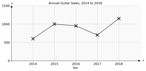
Question 2: Roger decided to draw a line graph to represent the data shown in the table below on the number of guitars sold by a music shop over the course of 5 years.

State two mistakes that Roger made in drawing his line graph.
[2 marks]
The first mistake Roger made is that he didn’t label one of his axes.
The second mistake he made is that he plotted the 2014 point at 600 when it should be at 700.
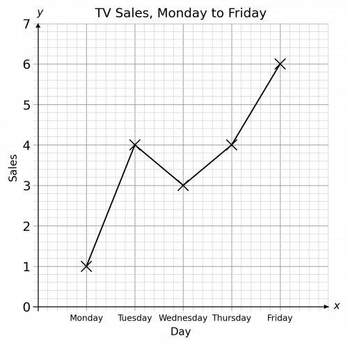
Question 3: An electronics shop records the number of TVs sold over the course of a week. The number of TVs sold each day is shown in the table below. Draw a line graph to show this data.


[3 marks]
The line graph should have the days on the x-axis and the Number of TVs sold on the y-axis. It should also have the axes clearly labelled and an appropriate title at the top.
With all points plotted correctly and joined with straight lines, the line graph should look like:
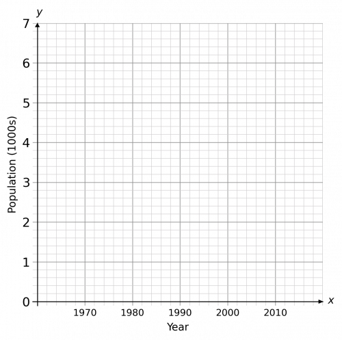
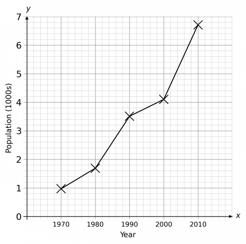
Question 4: The population of a small village is recorded every 10 years. Draw a line graph to show this data.

[3 marks]
The line graph should have the year on the x-axis and the population on the y-axis. It should also have the axes clearly labelled and an appropriate title at the top.
With all points plotted correctly and joined with straight lines, the line graph should look like:
Question 5: The Met office collects data on the total amount of rainfall in the UK for each month of the year. Draw a line graph to show this data.


[3 marks]
The line graph should have the month on the x-axis and the rainfall on the y-axis. It should also have the axes clearly labelled and an appropriate title at the top.
With all points plotted correctly and joined with straight lines, the line graph should look like:
