Cumulative Frequency Curves
Cumulative Frequency Curves Revision
Cumulative Frequency
Cumulative frequency is the number of times that anything up to and including that value (or group of values) appeared. You will need to be able to work out the cumulative frequency as well as use this to plot a cumulative frequency graph.
Make sure you are happy with the following topics before continuing.
Plotting a Cumulative Frequency graph
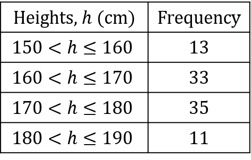

Below is a frequency table of data compiled on a group of college students’ heights.
Step 1: Construct a cumulative frequency table for this data.
Calculating the cumulative frequency is just adding up the frequencies as you go along.
The first value is the first frequency value, we then add this to the second value to get the second cumulative frequency value
13 + 33 = 46
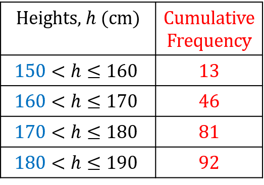

Continuing this, we get that
46 + 35 = 81
people were 180 cm of shorter, is
81 + 11 = 92
Step 2: Using the cumulative frequency, plot a cumulative frequency graph.
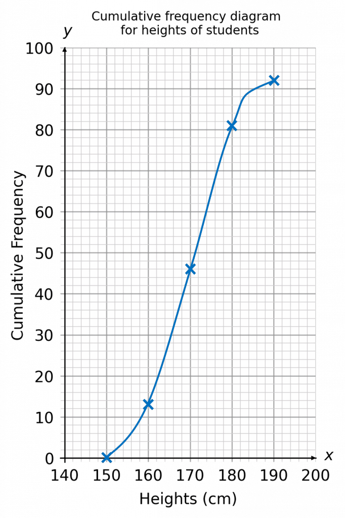

The points plotted on your graph should be plotted at the end of each class,
i.e. the point which has cumulative frequency of 13 should be plotted at 160 on the height axis, and so on.
You should join up the plotted points with a smooth curve. It should end up looking like an elongated ‘S’ shape.
Example: Finding the Median and IQR
Using the cumulative frequency graph below, calculate the median and interquartile range.
[3 marks]
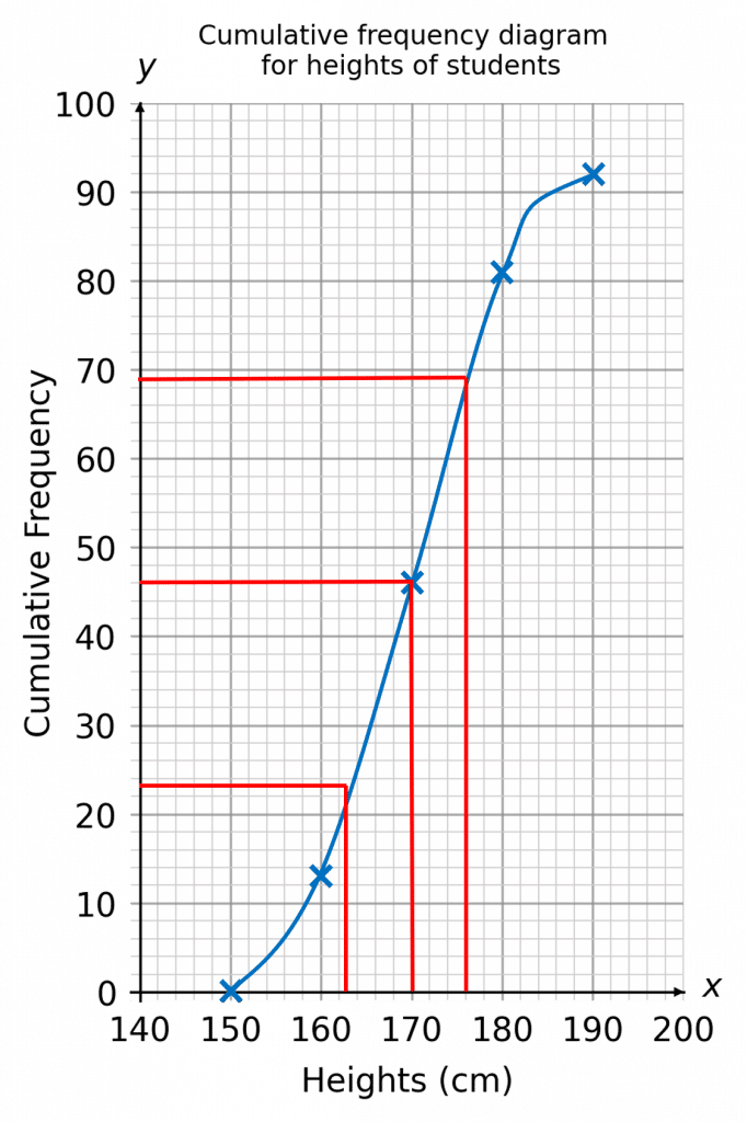

There are 92 people in total, so the lower quartile, median, and upper quartile will be the 23rd person, 46th person, and 69th person respectively. So, we find these points on the y-axis, and then draw a line across to the graph to find the corresponding heights on the x-axis. This is shown on the cumulative frequency graph below.
Here, we get
Q_1 = 163, \,\, \text{ median } = 170, \,\,Q_3 = 176
The interquartile range is therefore
176-163=13
Cumulative Frequency Curves Example Questions
Question 1: Below is a frequency table of data showing the amount of time people spent on a particular website in one day.
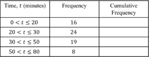
a) Complete the cumulative frequency column in the table above.
[2 marks]
b) Using the data from your table, plot a cumulative frequency graph on the axes below.
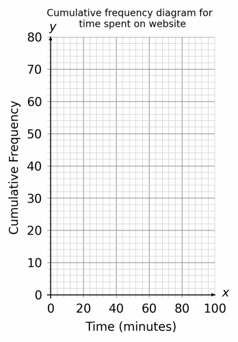
[3 marks]
a) For the cumulative frequency column, we simply need to add up the frequencies as we move downwards in the table:
The first cumulative frequency box is simply the number 16.
For the second cumulative frequency box, we need to add 24 to the 16 from the previous cumulative frequency box.
24+16=40
For the third cumulative frequency box, we need to add 19 to the 40 from the previous cumulative frequency box.
19+40=59
This process of adding the frequency total to the cumulative frequency total repeats until the table is complete.
The final table should look like this:

b) For the cumulative frequency diagram, we need to plot the time in minutes along the x-axis and your cumulative frequency totals on the y-axis.
Then we need to plot each of the cumulative frequency figures with the corresponding class interval maximums. In other words, for the time interval of 0 - 20 minutes, you would go along the x-axis to 20 minutes (the maximum in this time range) and go upwards to the cumulative frequency value of 16.
Once you have plotted all points, including the origin (0,0), join up all points with a smooth curve. (A cumulative frequency graph is always a smooth curve which goes up.)
Your graph should look like this:
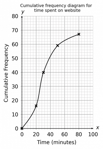
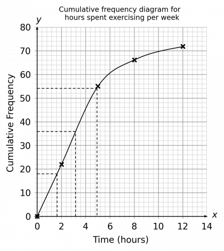
Question 2: Shown below is a cumulative frequency graph showing the number of hours per week people spent exercising. Draw a box plot to represent this same information.
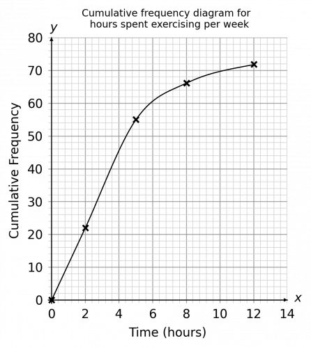
[4 marks]
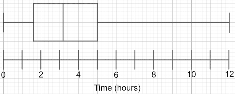
From the graph, we can see that the minimum number of hours was 0 and the maximum was 12.
We can also see from the graph that is represents exercising data from 72 people since this is where the graph ends.
In order to draw a box plot, we need to know the following values:
a) the minimum value
b) the maximum value
c) the median value
d) the lower quartile
e) the upper quartile
We have already established that the minimum value is 0 and the maximum value is 72.
The median value is the middle value. Since there are 72 values in total, then the median value is the 36th value (since 36 is half of 72). If we go up the y-axis and locate the 36th value, go across to the line and then down, we can see that is corresponds to a value of 3.2 hours.
The lower quartile is half-way between the first value and the median. To work out which value is the lower quartile, find \frac{1}{4} of the total number of values:
72 \div4 = 18
The lower quartile is therefore the value of the 18th term. If we go up the y-axis and locate the 18th value, go across to the line and then down, we can see that is corresponds to a value of 1.6 hours.
The upper quartile is half-way between the final value and the median values. To work out which value is the upper quartile, simply find \frac{3}{4} of the total number of values:
\dfrac{3}{4}\times72 = 54
The upper quartile is therefore the value of the 54th term. If we go up the y-axis and locate the 54th value, go across to the line and then down, we can see that is corresponds to a value of 5 hours.
The graph below illustrates the above:
Using this information, the resulting box plot will look like this:
Question 3: The below table shows the number of cars at a showroom and the price brackets that they fall in to:
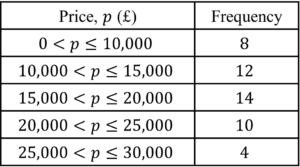
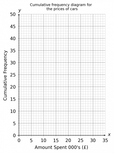
a) Complete the cumulative frequency table, and draw a cumulative frequency graph to represent this data:
[4 marks]
 From your graph work out:
b) the approximate median price of a second-hand car
[2 marks]
c) an estimate for how many cars cost more than £17,500
[2 marks]
a) We know that there are 8 cars with a value between £0 and £10,000[/latex], so we can insert 8 in the £0 - £10,000 cumulative frequency box.
The next box is the £0 - £15,000 box. We know that there are 8 cars with a value of less than £10,000, and a further 12 cars which have a value of more than £10,000 but less than £15,000, therefore 20 cars have a value of between £0 and £15,000, so this is the next value we can insert.
Continue this process until all values are calculated and your cumulative frequency table should look as follows:

To draw the graph, we need to plot the cumulative frequency totals on the vertical axis (the cumulative frequency is always on the y-axis and the price in pounds on the x-axis. However, since we are dealing with grouped data (the prices are price bands), we need to plot the cumulative frequency total against the highest value in the band. So, the first point we plot (after plotting (0,0), the origin) would be the cumulative frequency total of 8 against £10,000 (the top value in the £0 - £10,000 band). The next point we would plot would be the cumulative frequency value of 20 against £15,000 (the highest value in the £10,000 - £15,000 band).
Your completed cumulative frequency graph should look as follows:
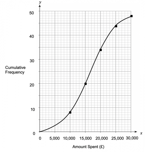
b) We know that there are 48 cars in the showroom in total (since the maximum value on the cumulative frequency table is 48). To find the median, we need to read the value of the car that corresponds to a cumulative frequency total of 24 (half of 48). By locating the value of 24 on the cumulative frequency axis, we can see that this corresponds to a value of approximately £16,000.
c) For this question, we need to locate £17,500 on the x-axis and see what cumulative frequency total this corresponds to. By drawing a line up from £17,500 until it touches the line and then drawing a horizontal line to the y-axis, we should hit a cumulative frequency total of approximately 26.
This means that 26 cars have a value that is up to £17,500. Therefore the remaining cars must have a value which is greater than £17,500. Since there are 48 cars in total then the number of cars which have a value of more than £17,500 is simply 48-26=22 cars.
Question 4: The lengths of snakes kept in Bob Exotic’s Snake Sanctuary were recorded. The below table shows this information:

a) Draw a cumulative frequency graph for this information on the axes below.
[3 marks]
b) What is the interquartile range for the length of these snakes?
[3 marks]
c) In another snake sanctuary in the same country, the median length of their snakes is 1.78m. To one decimal place, by what percentage are these snakes smaller than the snakes in Bob Exotic’s Snake Sanctuary?
[3 marks]
a) In order to draw our cumulative frequency graph, we need to work out the cumulative frequency totals:

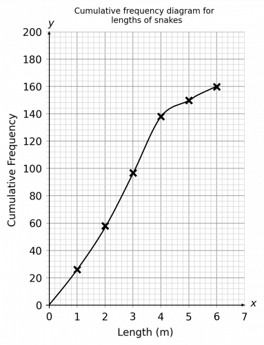
To represent this information on a graph, we need to plot the cumulative frequency totals on the vertical axis against snake length on the horizontal axis. After plotting our first point of (0,0), the next point is (1,23); the key thing to remember is that since the snake length data is grouped, we need to plot the highest value in each length band (so for the 0 metres – 1 metre band, we would plot the corresponding cumulative frequency total against 1 metre). Once we have plotted all the points, we need to join them together with a smooth line, with an end result similar to the below:
 b) The interquartile range is calculated by subtracting the lower quartile from the upper quartile.
In this data set, the lower quartile is the length of the 40th snake (40 because 40 is \frac{1}{4} of 160. To find the length of the 40th snake, find 40 on the vertical cumulative frequency axis and find the corresponding length on the horizonal axis. The length of the 40th snake is approximately 1.5 metres.
In this data set, the upper quartile is the length of the 120th snake (120 because 120 is \frac{3}{4} of 160. To find the length of the 120th snake, find 120 on the vertical cumulative frequency axis and find the corresponding length on the horizonal axis. The length of the 120th snake is approximately 3.5 metres.
Therefore the interquartile ranges is 2 metres.
c) For this question, we need to work out the median snake length at Bob Exotic’s Snake Sanctuary. Since there are 160 snakes in total, the median snake length is the length of the 80th snake (80 because 80 is \frac{1}{2} of 160. The 80th snake has a length of approximately 2.6m.
If at the other snake sanctuary, the median snake length is 1.78 metres, then to calculate how much smaller as a percentage, we need to find out how much smaller the median snake is:
2.6\text{ m } – 1.78\text{ m} = 0.82\text{ m}
To work out a percentage increase or decrease, you need to remember the simply formula:
\dfrac{ \text{ difference}}{\text{ original value}}\times 100
\dfrac{0.82\text{ m}}{2.6\text{ m}}\times 100=31.5\%
(In this question, however, it may not be obvious what the original value is. The question asks us to work out by what percentage these snakes are smaller than the snakes in Bob Exotic’s Snake Sanctuary. Because of the word ‘than’, it is the length of the snakes at Bob Exotic’s Snake Sanctuary that we should consider as the ‘original’ value. Words / phrases like ‘compared to’ or ‘than’ always indicate what we are working out a percentage of.)


