Presenting Data
Presenting Data Revision
Presenting Data
Note: It is assumed that you know this prior knowledge from GCSE.
Graphical representation of data is an important skill. It is essential not only to know how to create bar charts, stem and leaf diagrams and histograms, but also to be able to interpret these to find measures of central tendency and variation.
Bar Charts
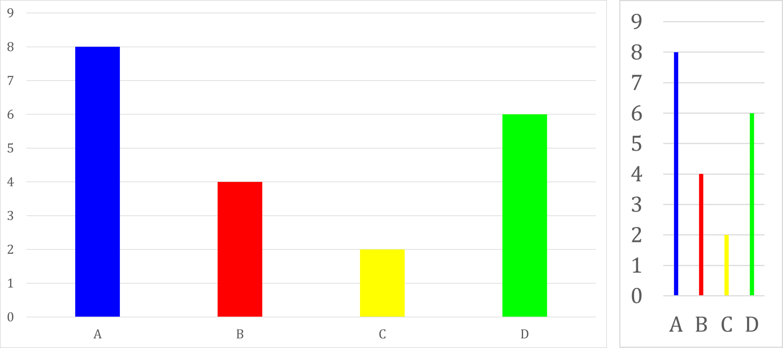
One way to represent data is a bar chart. The height of each bar represents the data point for each category.
Note: bar charts come in many different forms, including with bars placed horizontally instead of vertically, or even with lines or dots instead of bars.
Pictured below is a standard bar chart and a bar chart using lines instead of bars.
Stem and Leaf Diagrams
Stem and leaf diagrams are another way of representing data. It allows raw data to be listed in a space efficient way. The single digit behind the line represents tens (or hundreds, etc) and the digits after the line represent all the units for that tens that are in the data set. For example, 2|3\;4\;5 means 23, 24 and 25 are in the data set.
For example, if Mrs Chivers wants to plot the scores in a maths test of class C, she can write:
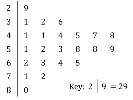
IMPORTANT NOTE: Don’t forget the key, or you will lose a mark.
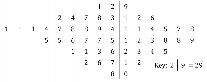
Stem and leaf diagrams can also be double sided, so if Mrs Chivers wanted to add the scores for class H, while distinguishing between the classes still, she could write:
Measures of Central Tendency from Stem and Leaf Diagrams
Since stem and leaf diagrams provide us with all of the raw data, it is simple to calculate the mean, median and mode from them. All we need to do is write it out as raw data then use that.
Example: Consider again Mrs Chivers’ stem and leaf diagram for her two classes:

From the shape of the stem and leaf diagram, it would look like class \text{C} has slightly higher marks overall compared to class \text{H}. To find out if this is the case, we can calculate the mean for each class:
\text{class C mean}=\dfrac{29+31+32+36+41+...}{23}=52.26
\text{class H mean}=\dfrac{21+32+34+37+38+...}{23}=43.30
So our original intuition was correct, the mean for class \text{C} is higher.
We can also find the median of class \text{C}. Conveniently, the stem and leaf diagram already provides our data in order, so we do not need to sort it, we can work on it as it is presented to us. One method is to cross the highest and lowest value off simultaneously, then the second highest and second lowest, then the third highest and third lowest, and so on until only the middle value or middle two values remain. In this case, the median for class \text{C} is 52.
Finally, the mode of all marks can be found with ease. Again, since we are presented with the raw data, we can see clearly which number appears most often. Here, the mode is 41, which appears five times (three times in class \text{H} and twice in class \text{C}).
Histograms
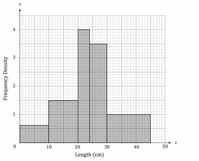
A histogram looks like a bar chart, except the columns can be different widths, and we plot frequency density instead of frequency. In histograms, the area of each rectangle tells you the frequency of the data class, with the width of rectangles usually indicating the size of the data class they represent. This gives a formula:
\text{frequency}=\text{class width}\times\text{frequency density}
Example:

The first class has a width of 10, so the rectangle in the histogram should have a width of 10. It has a frequency of 6, so the rectangle in the histogram should have an area of 6. This means that its height must be 0.6, which can be seen on the histogram below.
The second class has a width of 10, so the rectangle in the histogram should have a width of 10. It has a frequency of 15, so the rectangle in the histogram should have an area of 15. This means that its height must be 1.5, which can be seen on the histogram below.
The third class has a width of 4, so the rectangle in the histogram should have a width of 4. It has a frequency of 16, so the rectangle in the histogram should have an area of 16. This means that its height must be 4, which can be seen on the histogram below.
The fourth class has a width of 6, so the rectangle in the histogram should have a width of 6. It has a frequency of 21, so the rectangle in the histogram should have an area of 21. This means that its height must be 3.5, which can be seen on the histogram below.
The fifth class has a width of 15, so the rectangle in the histogram should have a width of 15. It has a frequency of 15, so the rectangle in the histogram should have an area of 15. This means that its height must be 1, which can be seen on the histogram below.
More about histograms can be found on the Grouped Data page.
Presenting Data Example Questions
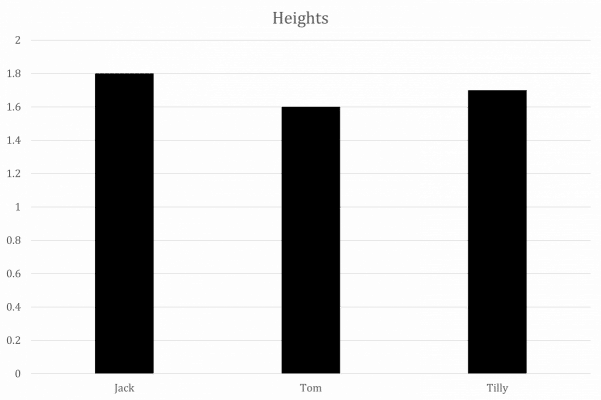
Question 1: Jack is 1.8 \text{ m} tall, Tom is 1.6\text{ m} tall and Tilly is 1.7\text{ m} tall. Represent this information on a bar chart.
[1 mark]
Question 2: This is a stem and leaf diagram of the number of all-time goals by the members of a football team.
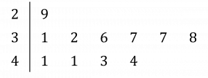
Find the mean, median and mode of this data.
[3 marks]
Mean: \dfrac{1}{11}(29+31+32+36+37+37+38+41+41+43+44)=37.2
Median: The middle value is 37
Mode: Both 37 and 41 appear twice, and every other value appears only once, so 37 and 41 are the two modes.
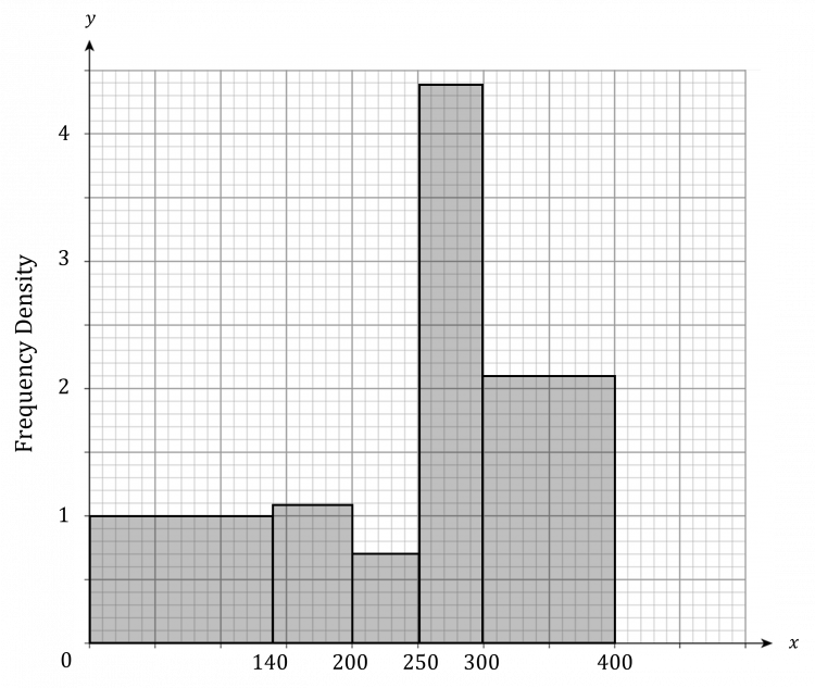
Question 3: Produce a histogram from the table below.

[4 marks]
Presenting Data Worksheet and Example Questions
Single Variable Data and Histograms
A LevelYou May Also Like...

MME Learning Portal
Online exams, practice questions and revision videos for every GCSE level 9-1 topic! No fees, no trial period, just totally free access to the UK’s best GCSE maths revision platform.
